
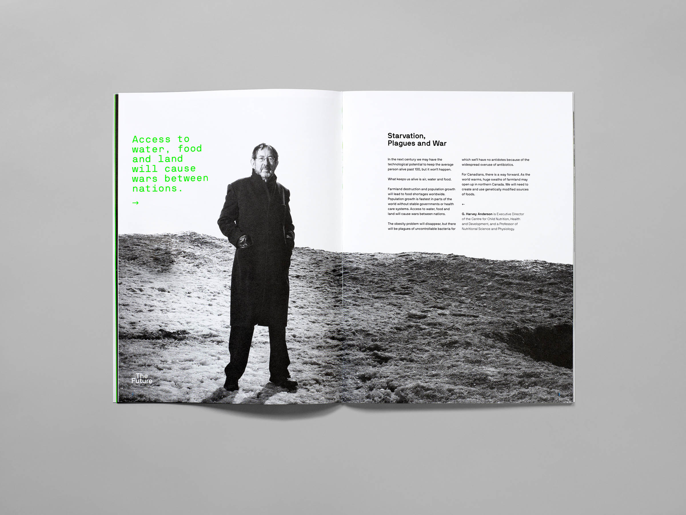
UofTMed Magazine
Editorial Design
Creative Direction
Art Direction
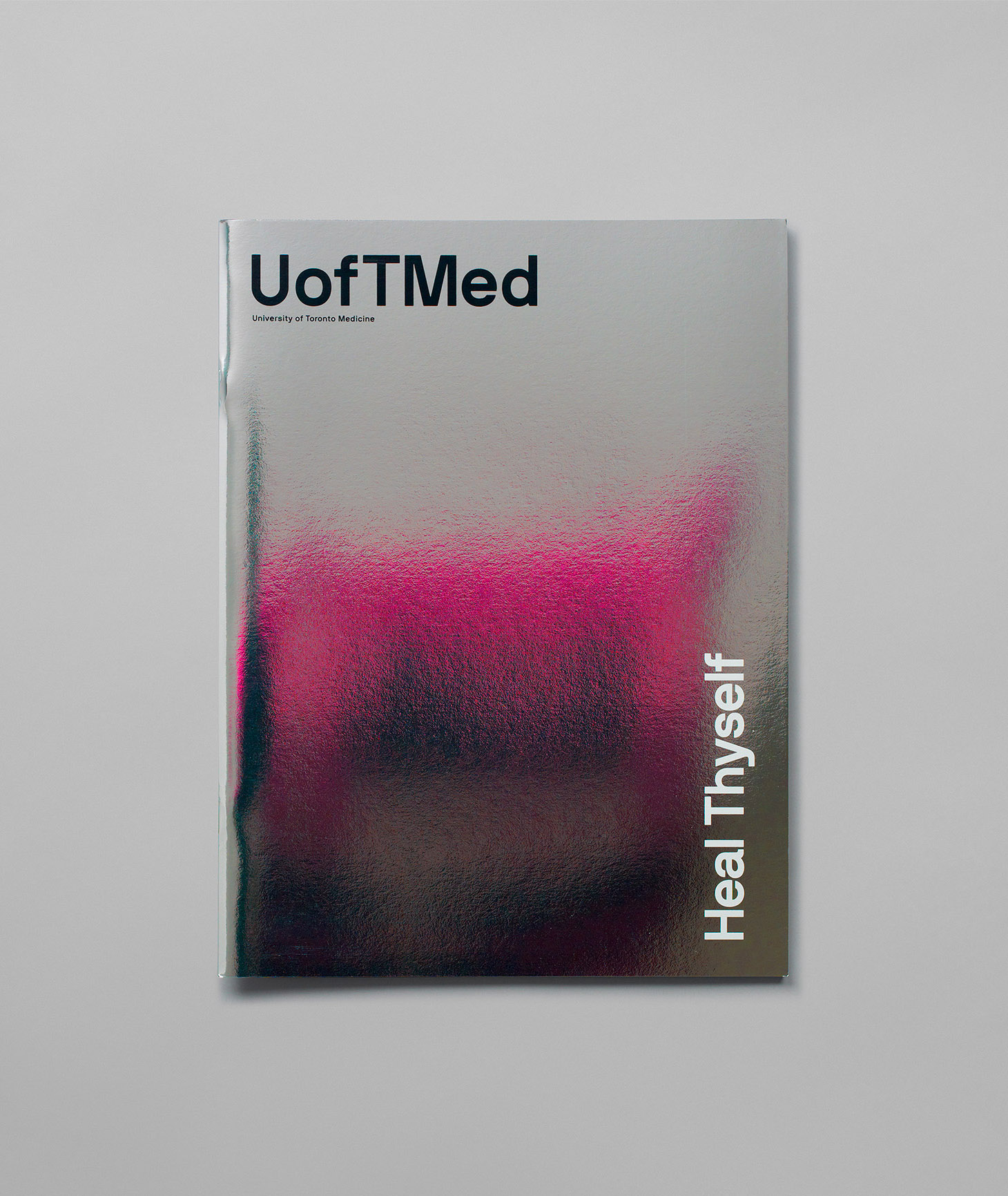
Redesign and art direction of UofTMed the Alumni magazine for the Faculty of Medicine at University of Toronto. As a main brand piece with a reach of more 28,000 readers, it has two main objectives: to engage alumni and keep them informed about how their alma mater is tackling issues of great societal importance through research and education; and to provide an opportunity for graduates to show pride by displaying the magazine prominently in their waiting rooms, offices and homes.
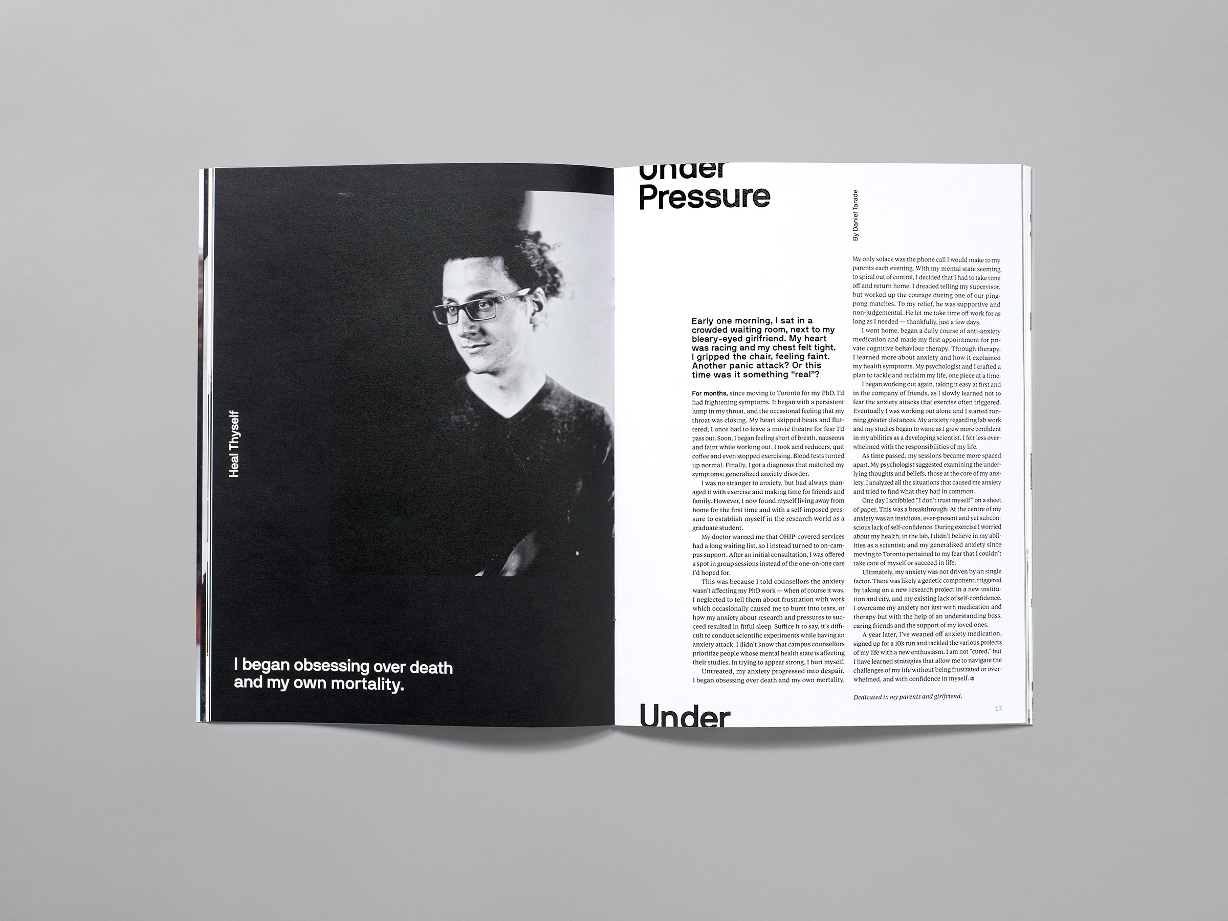
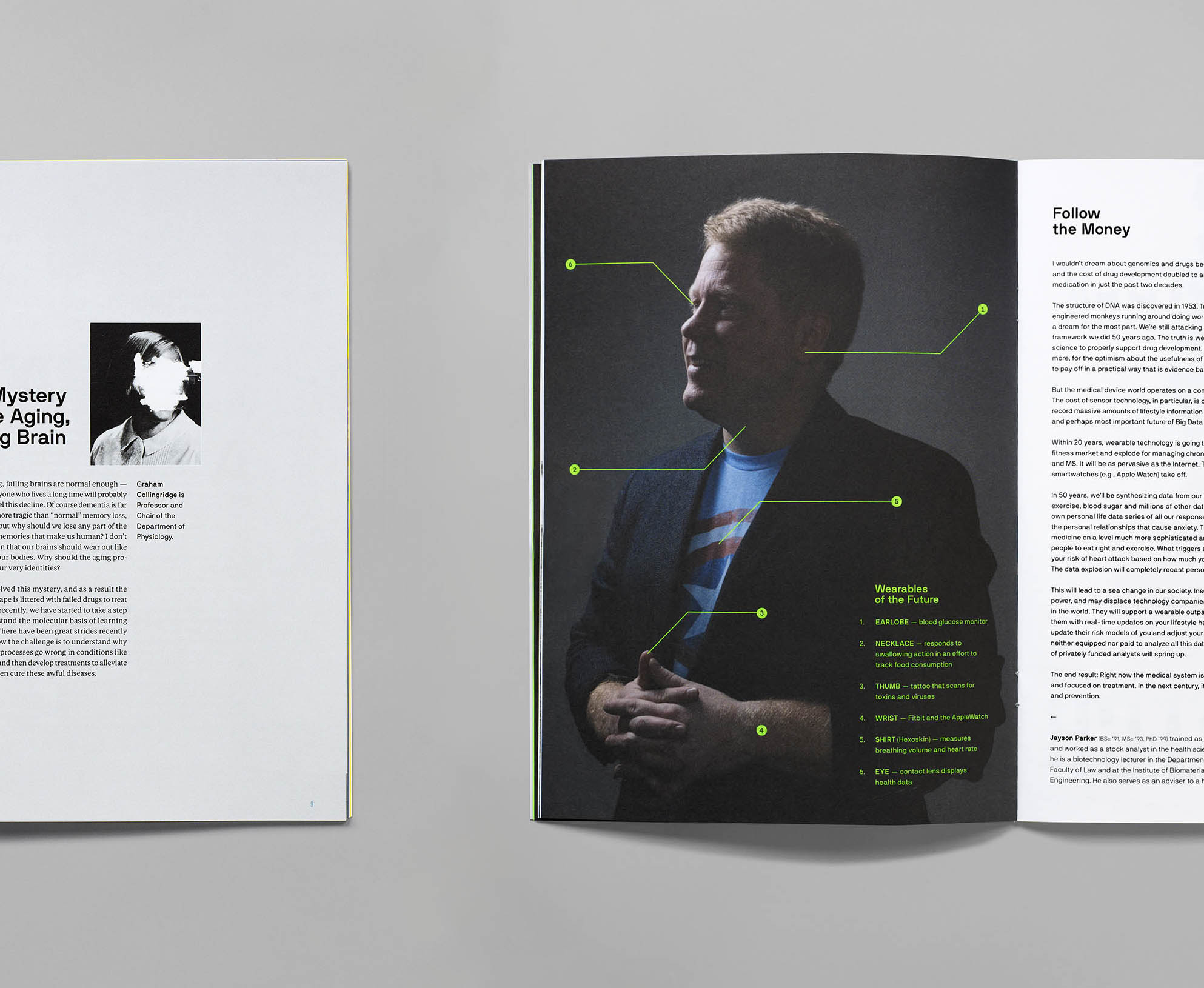
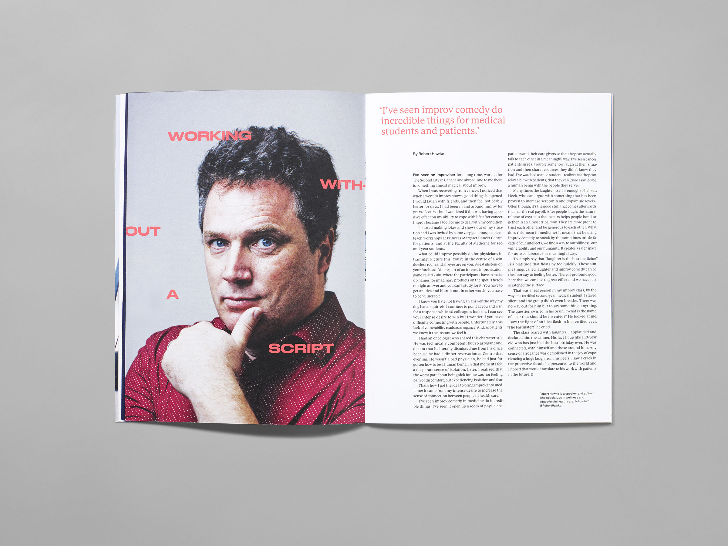
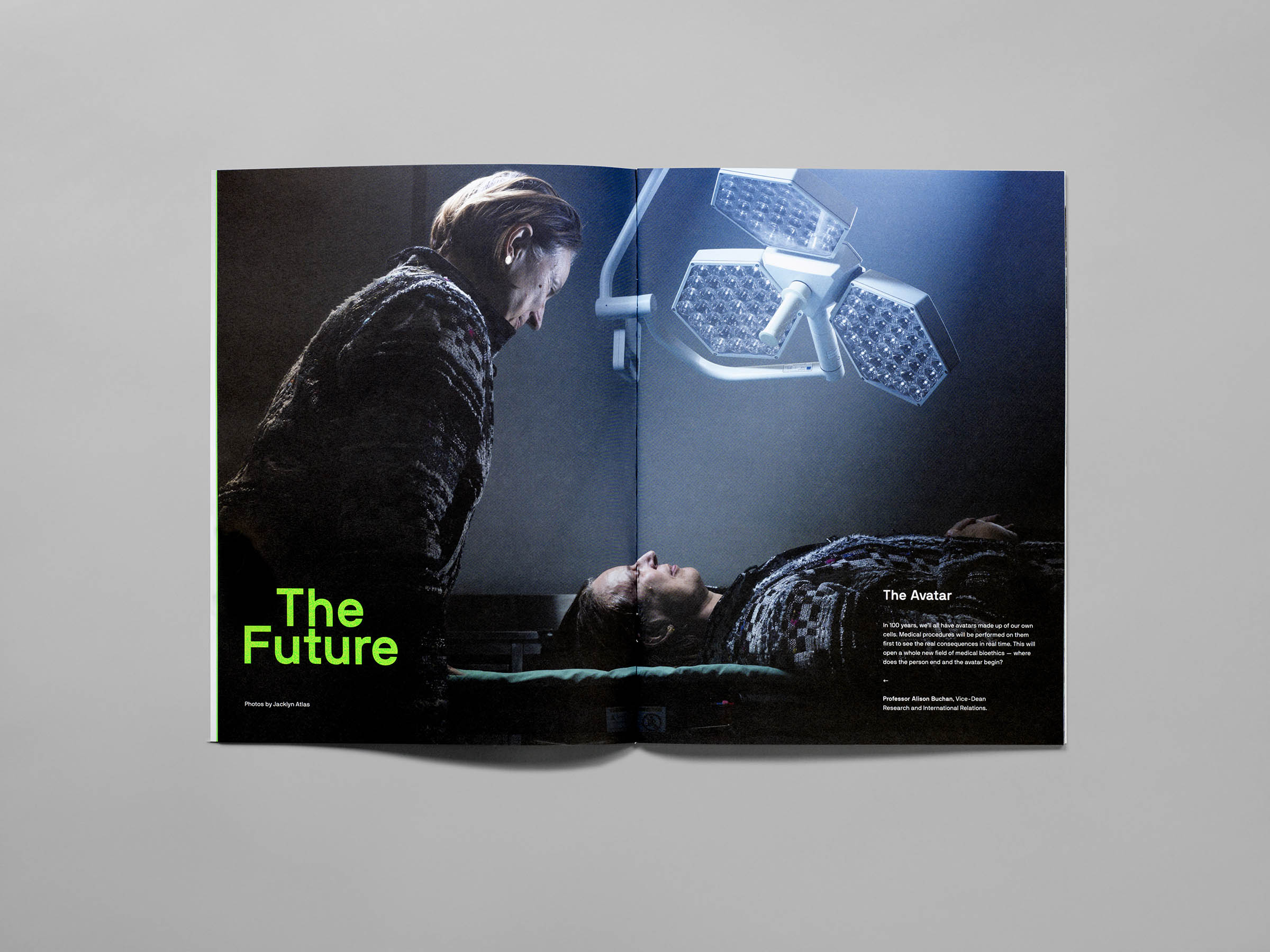
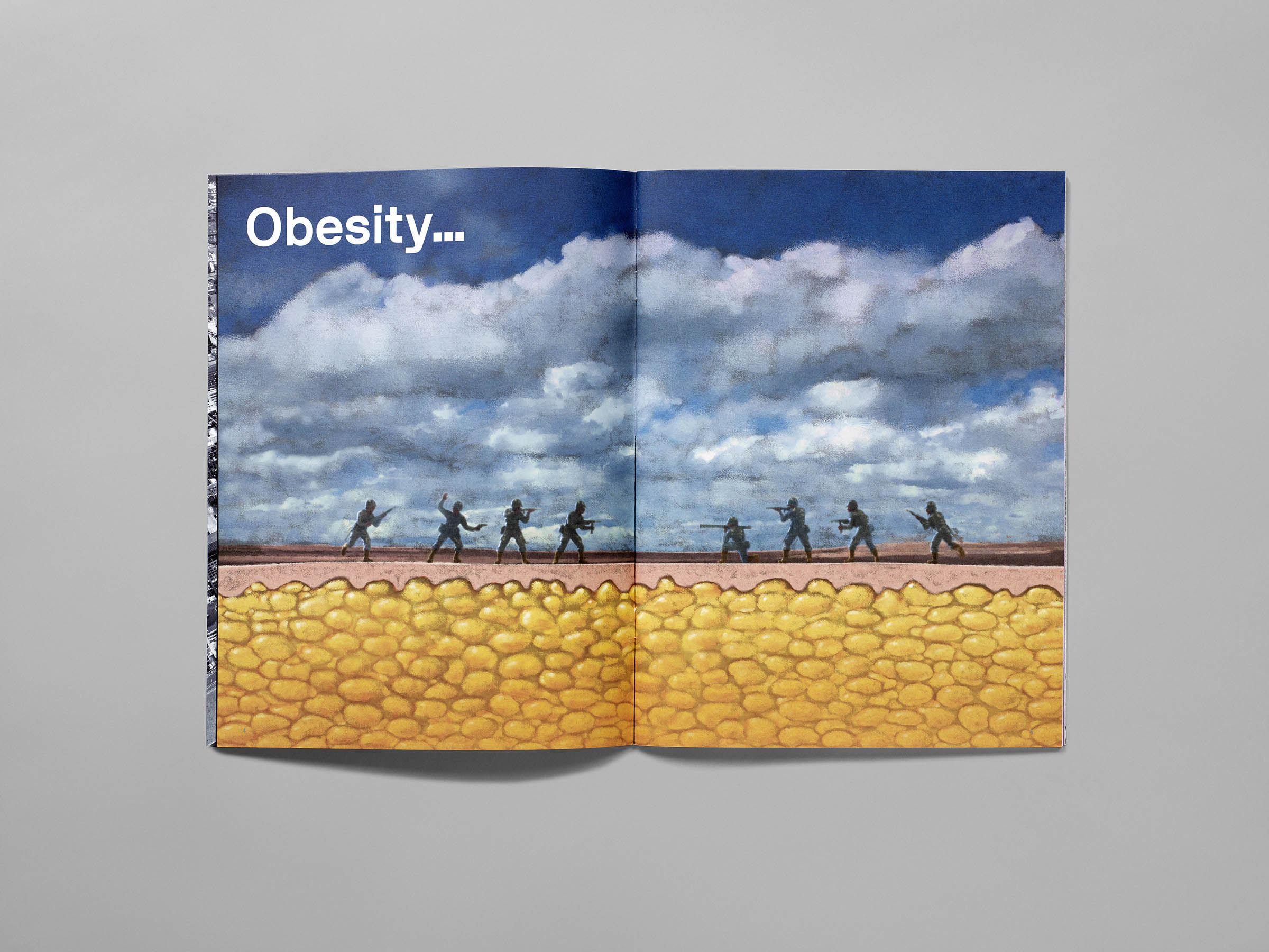
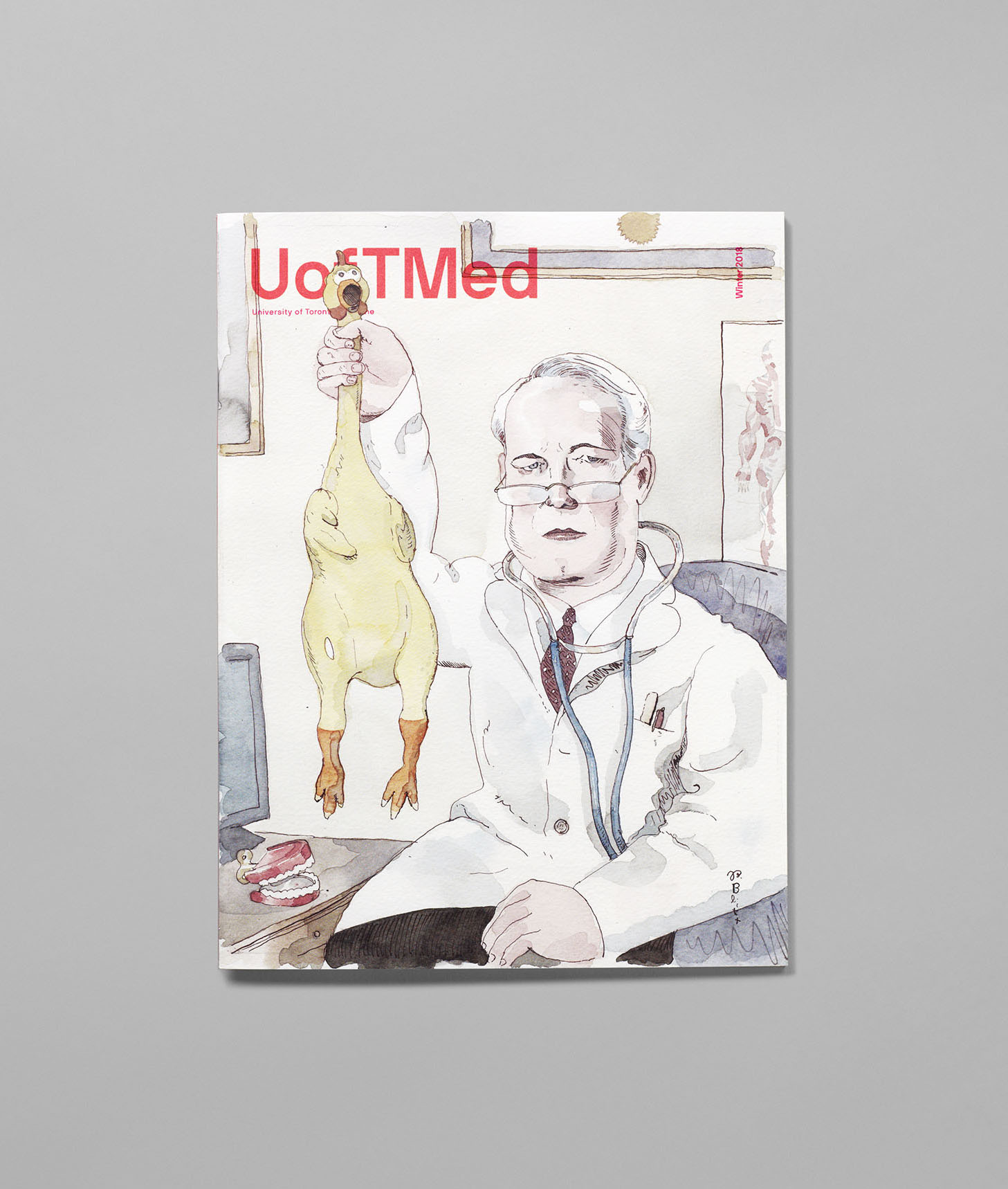
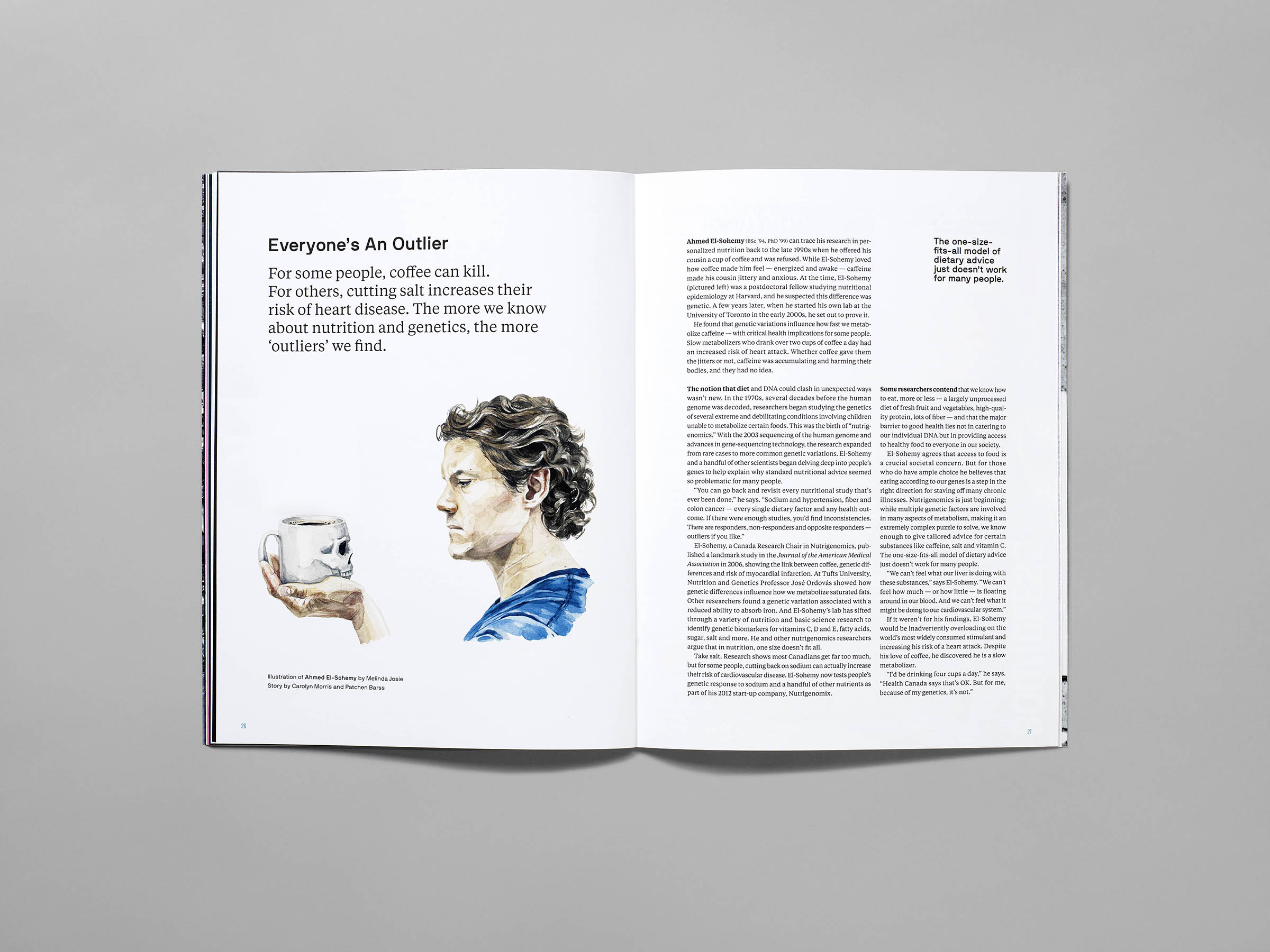
We wanted to design a publication that would transcend style trends and withstand the wear and tear of being shared between many people. It’s not your typical throw-away magazine, and — though it may be boiled down to this — we do not want the magazine to be perceived as a typical bland, flat corporate PR piece. We commissioned art and photography that was witty, surprising and often tongue-in-cheek — while still being meaningful to the stories they illustrate. By carefully using contemporary typefaces used in bold, unconventional and sometimes “uncouth” ways, we were able to create fresh and interesting editorial layouts. To add additional impact, we opted to use a special fluorescent Pantone for each issue. Print is not dead and we wanted to prove it.
- Three National Magazine Awards Nominations (Honuorable Mentions) 2018 and 2019
- Council for Advancement and Support of Education (CASE) Grand Gold Award 2016, Magazine of the Year 2016, Gold 2017 and 2018

©r/grainger